When displaying an image, we have two options:
- Use a system image
- Import our own image into the project
System Images
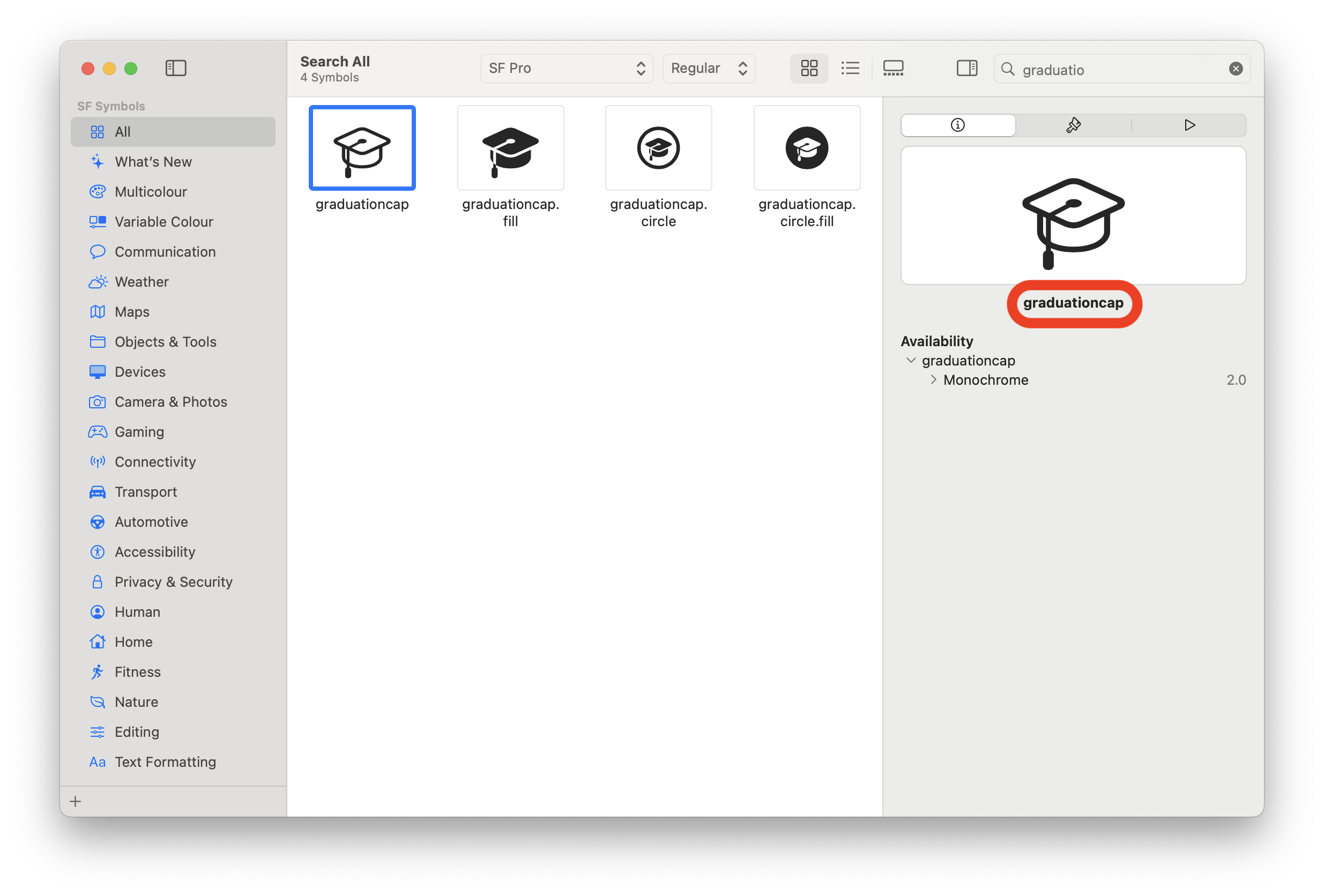
Apple has created SF Symbols, a library of images that we can use for free. These images are mostly useful as icons.
You can download this library at: https://developer.apple.com/sf-symbols/
This library is installed on our Mac, and we’ll use it only to get the name of the image we like.
When selecting an image, you can see its name on the right side of the screen, in this case, graduationcap. This is the String we’ll use in our component:
Image(systemName: "graduationcap")
As you can see, when using this component, the image appears very small, which is the default size for these images. However, we can change the size with .frame(). But first, we need to use the .resizable() modifier to ensure the size change affects not only the component but also its content.
Image(systemName: "graduationcap")
    .resizable()
    .frame(width: 100, height: 100)
Importing an Image
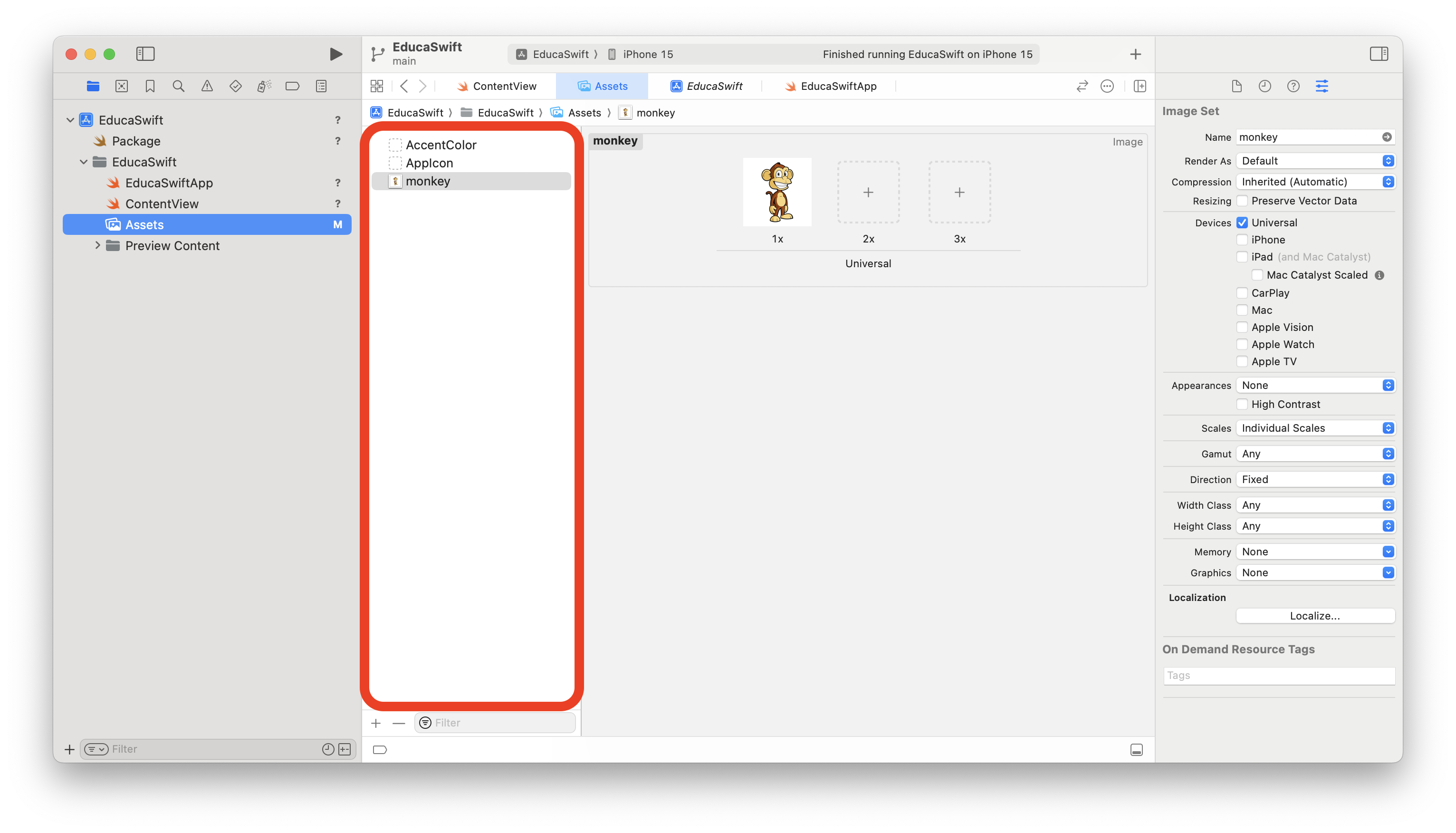
In the project navigator, you’ll find the Assets folder. Select this folder and drag the image you like to the area indicated in the following image.
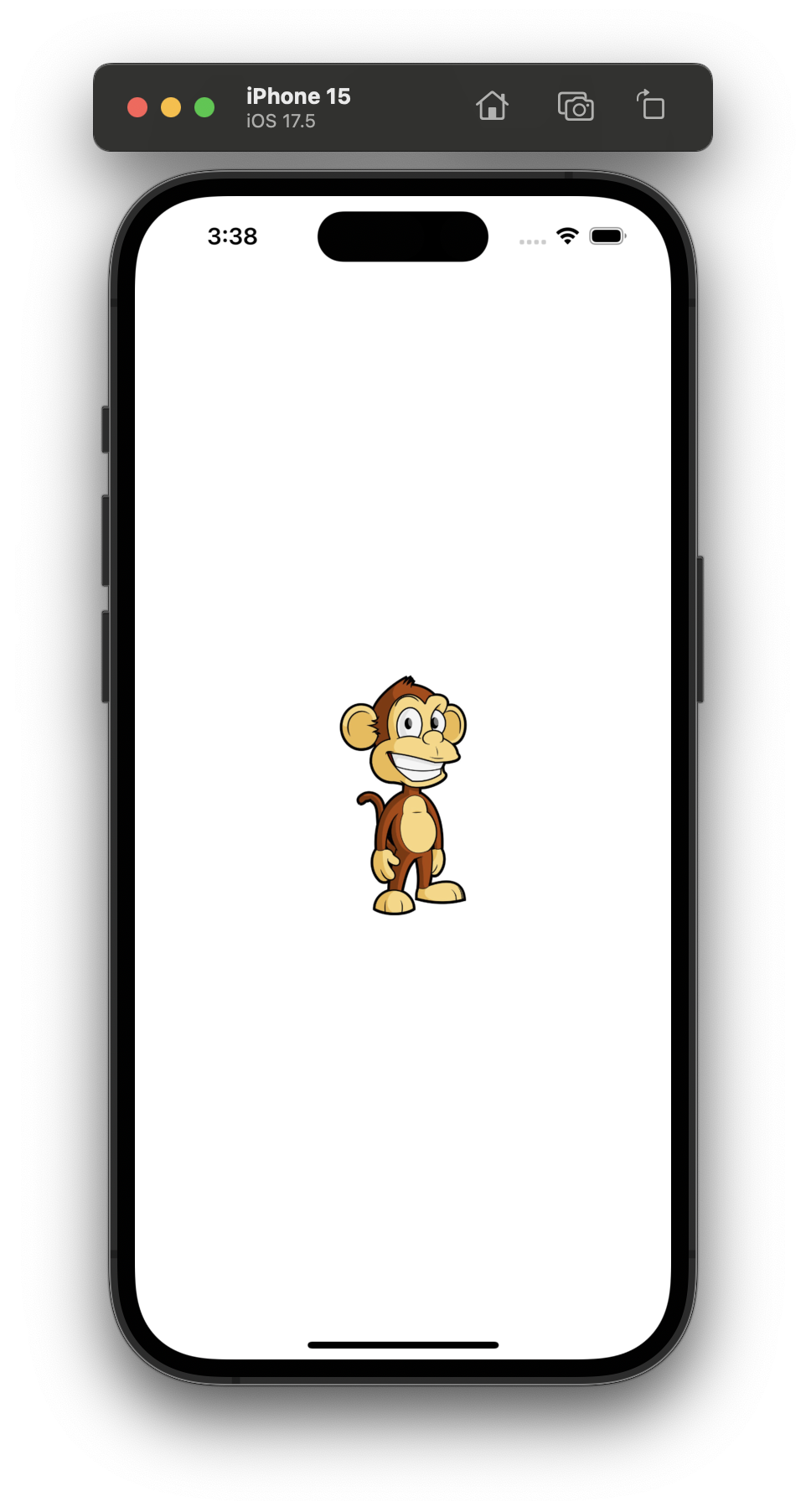
Now we can use our image by referencing the name we defined in Assets.
Image("monkey")
    .resizable()
    .frame(width: 200, height: 200)
Aspect Ratio
In the previous example, we defined a square size for a square image, but often images are rectangular, while we need to display them in a square container. Let’s see an example with a rectangular image, where we’ve also added a black border to show the size of the component.
Image("cartoon")
    .resizable()
    .frame(width: 200, height: 200)
    .border(Color.black)
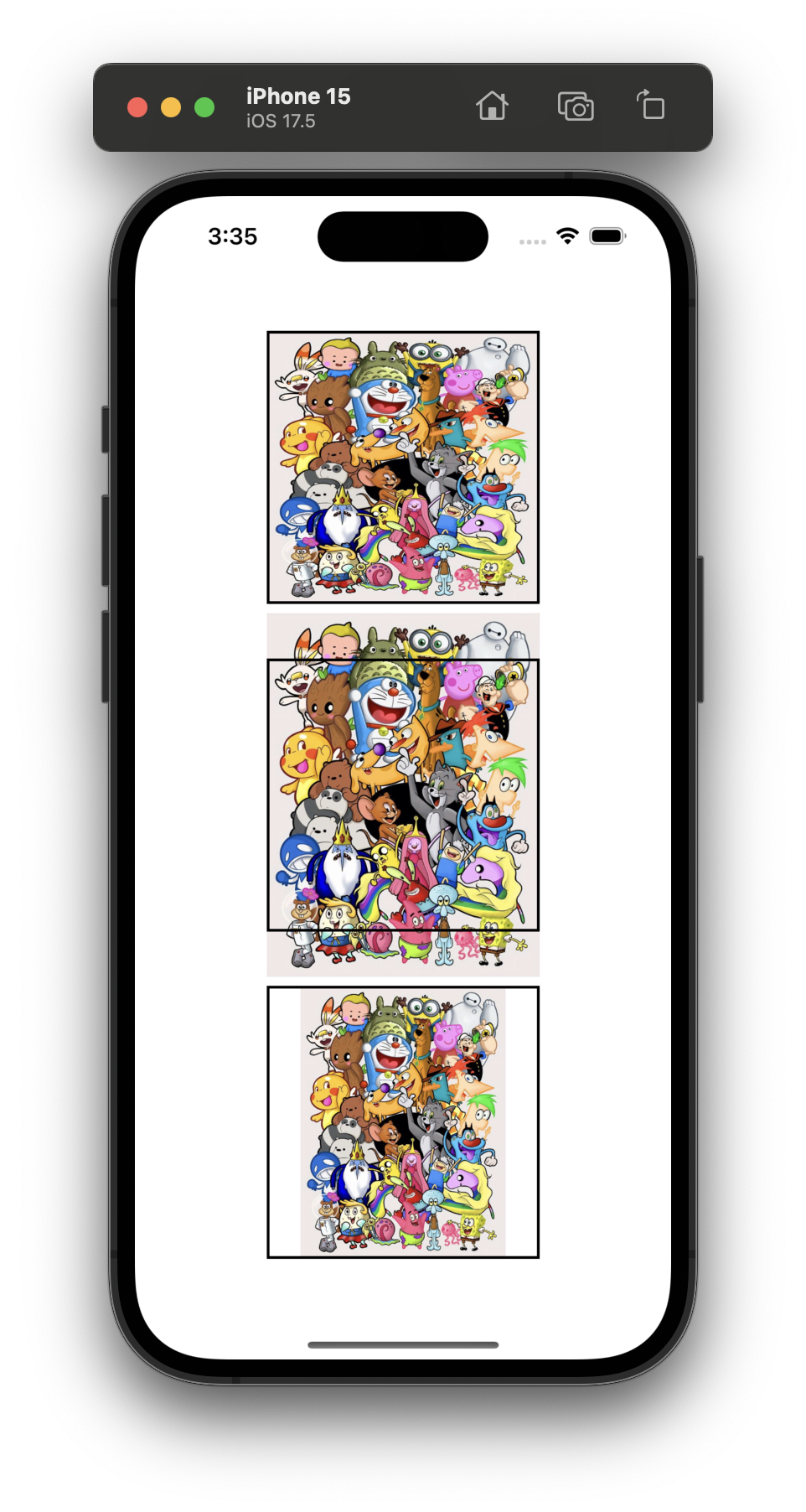
As you can see, the image is distorted to fit into the 200x200 size we defined. To avoid this, we can tell it to maintain the aspect ratio of the image.
We have two options for keeping the aspect ratio:
- Fit: The image remains inside the component's frame (black border).
- Fill: The image fills the component's frame.
Check the following image to see the different options:
import SwiftUI

struct ContentView: View {

    var body: some View {
        VStack {
            Spacer()
            Image("cartoon")
                .resizable()
                .frame(width: 200, height: 200)
                .border(.black, width: 2)

            Spacer()

            Image("cartoon")
                .resizable()
                .aspectRatio(contentMode: .fill)
                .frame(width: 200, height: 200)
                .border(.black, width: 2)

            Spacer()

            Image("cartoon")
                .resizable()
                .aspectRatio(contentMode: .fit)
                .frame(width: 200, height: 200)
                .border(.black, width: 2)
            Spacer()
        }
    }
}

#Preview {
    ContentView()
}
.fill, you can use the .clipped() modifier.


Be the first to comment