ZStack is a powerful layout tool in SwiftUI that allows you to layer views on top of each other along the z-axis. Unlike HStack (horizontal stacking) and VStack (vertical stacking), which arrange views side-by-side or top-to-bottom, ZStack enables views to overlap, making it an ideal choice for creating complex layouts, backgrounds, and custom UI components.
Basic Usage of ZStack
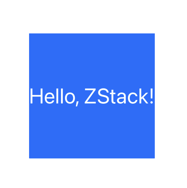
The ZStack container places its child views on top of each other, with the first view in the code at the bottom and the last view at the top. Here's a simple example:
ZStack {
    Color.blue
        .frame(width: 200, height: 200)

    Text("Hello, ZStack!")
        .font(.largeTitle)
        .foregroundColor(.white)
}
In this example, we create a blue square using a Color view and layer a Text view on top of it. The Text appears centered by default, overlapping the blue background.
Aligning Views in ZStack
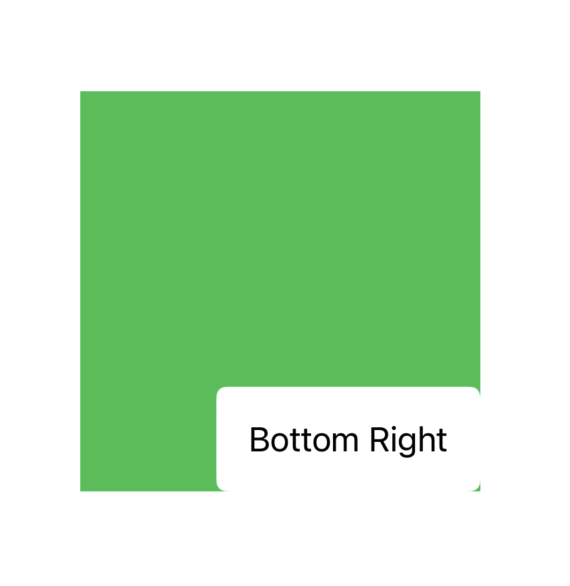
By default, all views inside a ZStack are centered. However, SwiftUI provides alignment options that allow you to position views within the stack. You can use the alignment parameter to control the position of the views within the stack.
ZStack(alignment: .bottomTrailing) {
    Color.green
        .frame(width: 200, height: 200)

    Text("Bottom Right")
        .padding()
        .background(Color.white)
        .cornerRadius(5)
}
In this case, the alignment: .bottomTrailing modifier moves the Text view to the bottom-right corner of the ZStack, while the green background remains in the center. By adding .padding() and .background(Color.white), we also customize the appearance of the Text.
Layers and Overlapping Elements
One of the main advantages of using ZStack is the ability to create layered effects. You can add multiple overlapping elements to create visually rich interfaces, such as cards with shadows, badges, or custom button designs.
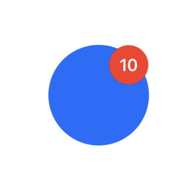
Example: Creating a Badge
Let’s create a simple badge that overlays a number on top of a circular button:
ZStack {
    Circle()
        .fill(Color.blue)
        .frame(width: 100, height: 100)

    Text("10")
        .font(.headline)
        .foregroundColor(.white)
        .padding(10)
        .background(Color.red)
        .clipShape(Circle())
        .offset(x: 30, y: -30)
}
In this example, we create a blue circular button using the Circle view. On top of the button, we add a red badge with the number “10”, using Text and a smaller circle as the background. The offset(x:y:) modifier is used to position the badge at the top-right corner of the circle.
Be the first to comment