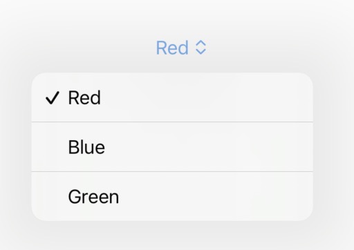
The Picker component allows the user to make a selection from multiple predefined options.
To add a Picker:
- We will declare the variable
myFavoriteColorto store the user's selection. - We will add all the options using the
Textcomponent, with the distinction that each option will be tagged using thetag()modifier.
To display the result, we will show the selection by adding a Text element that displays the value of myFavoriteColor.
@State var myFavoriteColor: String = "Red"

var body: some View {
    VStack {
        Picker("", selection: $myFavoriteColor) {
            Text("Red")
                .tag("Red")
            Text("Blue")
                .tag("Blue")
            Text("Green")
                .tag("Green")
        }

        Text("Color: \(myFavoriteColor)")
    }
}
Using other types of variables
We are not limited to selecting between String values. We can also use our own enum.
enum Flavor {
    case chocolate
    case vanilla
    case cream
}

@State var myFavoriteFlavor: Flavor = .chocolate

var body: some View {
    VStack {
        Picker("", selection: $myFavoriteFlavor) {
            Text("Chocolate")
                .tag(Flavor.chocolate)
            Text("Vanilla")
                .tag(Flavor.vanilla)
            Text("Cream")
                .tag(Flavor.cream)
        }

        Text("Flavor: \(myFavoriteFlavor)")
    }
}
The only difference you may notice is that each option is tagged with the corresponding case from our enum.
Styles
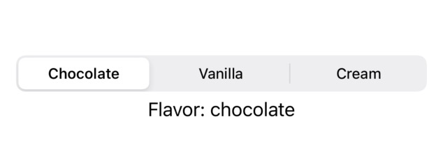
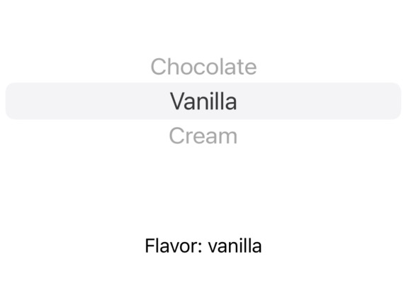
With the pickerStyle modifier, you can choose from various types of Picker.
Picker("", selection: $myFavoriteFlavor) {
    Text("Chocolate")
        .tag(Flavor.chocolate)
    Text("Vanilla")
        .tag(Flavor.vanilla)
    Text("Cream")
        .tag(Flavor.cream)
}
.pickerStyle(.segmented)
.pickerStyle(.inline)


Be the first to comment