A modifier has the power of add new styles or functions to a View.
As we've seen in previous articles, UI components are, actually, Views. That's the reason why we can use these modifiers on them.
This isn't new at all, we already used modifiers to change, for example, the font size of our Texts.
Text("Hello World")
	.font(.title)
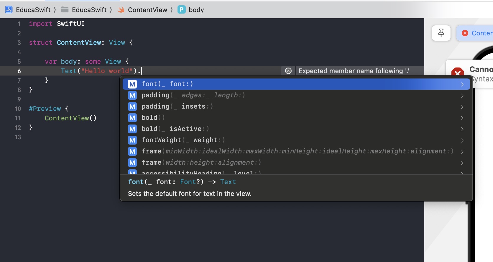
There are thousands of modifiers available, and you can create your own ones as we'll explore in other articles. You can see the modifiers pressing . key at the end of the component. Not all the modifiers can be applied in all the components since some of them are specific for each components.
Let's check the most common modifiers.
ForegroundStyle
This applies a color to the component content.
Text("Hello World")
  .foregroundStyle(.red)
Background
Apply a color, but this time to the background of the component.
Text("Hello World")
  .background(.green)
Frame
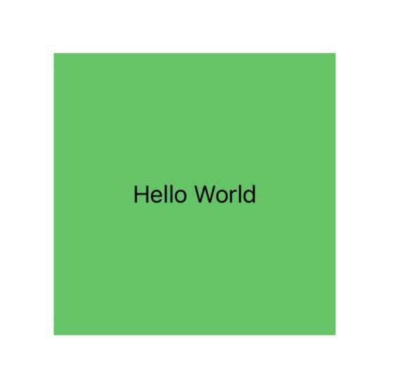
This modifier changes the size of our component. The best way to see the result is applying also a background color.
Text("Hello World")
	.frame(width: 200, height: 200)
	.background(.green)
Padding
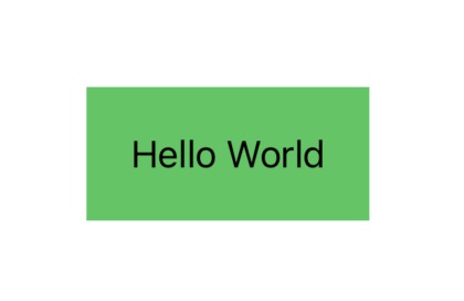
Add a padding space around the component content. Let's apply a background color as well.
Text("Hello World")
	.padding(20)
	.background(.green)
The order is important
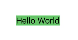
In the examples abov we've used the modifier background to visualize the size of the component, but, what if we add the modifiers in different order?
Text("Hello World")
	.background(.green)
	.frame(width: 200, height: 200)
As you can see, the green color is applied before changing the frame (size) of the component.


Be the first to comment