SwiftUI provides powerful tools to create grid-based layouts with LazyVGrid (Vertical) and LazyHGrid (Horizontal). These components allow us to build efficient, flexible, and responsive grid layouts in vertical and horizontal orientations.
Define the grid layout using GridItem
The GridItem struct is used to specify the layout of the grid cells. You can define the size and spacing of each column (LazyVGrid) or row (LazyHGrid). Here’s how to create a simple grid layout:
// Define a flexible grid with three columns
let columns = [
    GridItem(.flexible()),
    GridItem(.flexible()),
    GridItem(.flexible())
]
GridItem can have three types:
.fixed: Sets a fixed size for each item..flexible: Allows items to adjust their size to fill available space..adaptive: Adjusts the number of items to fit within a specified range.
Build a grid using LazyVGrid or LazyHGrid
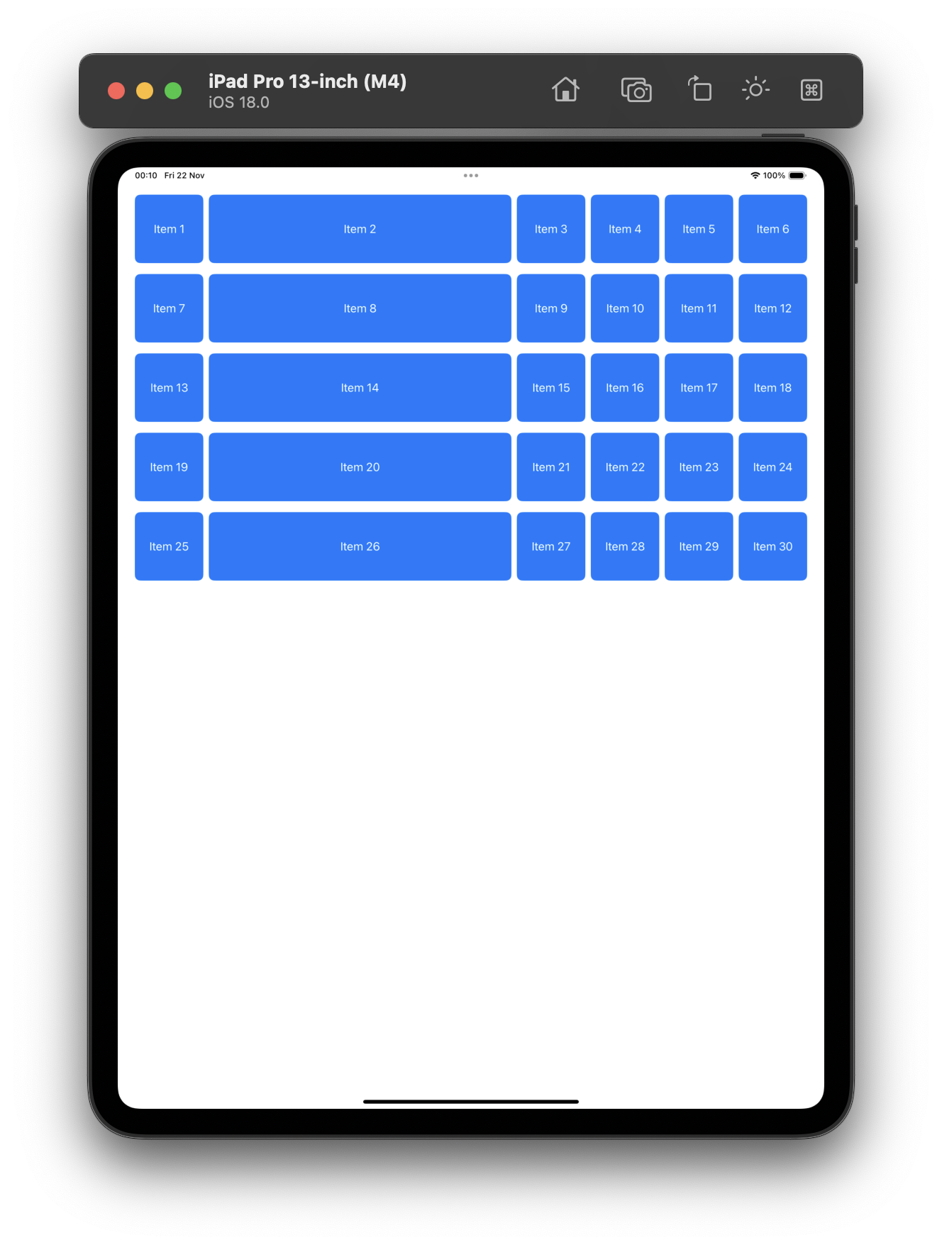
Let's create an example where we use the 3 types of columns:
import SwiftUI

struct ContentView: View {

    let columns = [
        GridItem(.fixed(100)),
        GridItem(.flexible()),
        GridItem(.adaptive(minimum: 100, maximum: 100))
    ]

    var body: some View {
        ScrollView {
            LazyVGrid(columns: columns, spacing: 16) {
                ForEach(1...30, id: \.self) { item in
                    Text("Item \(item)")
                        .frame(height: 100)
                        .frame(maxWidth: .infinity)
                        .background(Color.blue)
                        .cornerRadius(8)
                        .foregroundColor(.white)
                }
            }
            .padding()
        }
    }
}

#Preview {
    ContentView()
}
We've used .frame(maxWidth: .infinity) just to visualize the size of each column and how LazyVGrid can manage items size in order to conform the layout we defined.
The result is what it seems a 6 columns layout, but this is actually because the column 3 is adding all the items with the specific width that can fit.
Custom Layouts
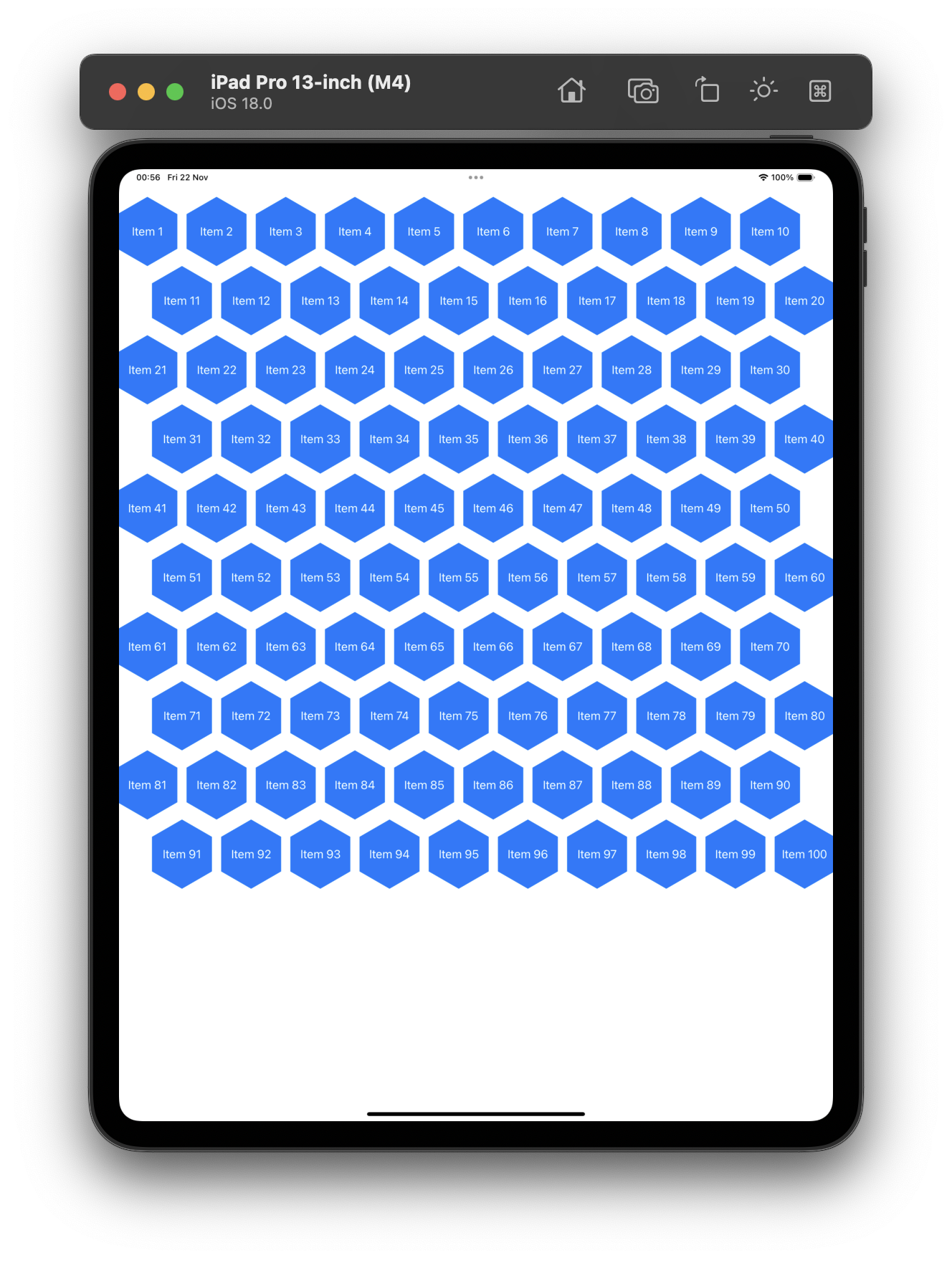
Let's see an example of how to do a custom grid that will look like a honeycomb.
First, let's define an Hexagon shape that we'll use in our items. We have borrowed this code from https://calebhearth.com.
struct Hexagon: Shape {
    func path(in rect: CGRect) -> Path {
        var path = Path()
        let center = CGPoint(x: rect.midX, y: rect.midY)
        let radius = min(rect.size.height, rect.size.width) / 2
        let corners = corners(center: center, radius: radius)
        path.move(to: corners[0])
        corners[1...5].forEach() { point in
            path.addLine(to: point)
        }
        path.closeSubpath()
        return path
    }

    func corners(center: CGPoint, radius: CGFloat) -> [CGPoint] {
        var points: [CGPoint] = []
        for i in (0...5) {
          let angle = CGFloat.pi / 3 * CGFloat(i)
          let point = CGPoint(
            x: center.x + radius * cos(angle),
            y: center.y + radius * sin(angle)
          )
          points.append(point)
        }
        return points
    }
}
In our main view, we are going to define the size of the items (100) and a layout of 10 fixed columns with the same size. This way we can use these values instead of adding random numbers directly to our views.
let numberOfColumns: Int = 10
let itemSize: CGSize = CGSize(width: 100, height: 100)

var columns: [GridItem] {
    Array(
        repeating: GridItem(.fixed(itemSize.width), spacing: 0),
        count: numberOfColumns
    )
}
Then, we'll apply our new Hexagon shape to our items, and apply an offset to the items depending on the column they are.
.clipShape(Hexagon())
.offset(y: yOffset(item: item))
func yOffset(item: Int) -> CGFloat {
    item % 2 == 0
    ? -(itemSize.width * 0.25)
    : (itemSize.width * 0.25)
}
Code
Here you have all the code together:
import SwiftUI

struct ContentView: View {

    let numberOfColumns: Int = 10
    let itemSize: CGSize = CGSize(width: 100, height: 100)

    var columns: [GridItem] {
        Array(
            repeating: GridItem(.fixed(itemSize.width), spacing: 0),
            count: numberOfColumns
        )
    }

    var body: some View {
        ScrollView {
            LazyVGrid(columns: columns, spacing: 0) {
                ForEach(1...100, id: \.self) { item in
                    Text("Item \(item)")
                        .frame(width: itemSize.width, height: itemSize.height)
                        .background(Color.blue)
                        .foregroundColor(.white)
                        .clipShape(Hexagon())
                        .offset(y: yOffset(item: item))
                }
            }
            .padding()
        }
    }

    func yOffset(item: Int) -> CGFloat {
        item % 2 == 0
        ? -(itemSize.width * 0.25)
        : (itemSize.width * 0.25)
    }
}

struct Hexagon: Shape {
    func path(in rect: CGRect) -> Path {
        var path = Path()
        let center = CGPoint(x: rect.midX, y: rect.midY)
        let radius = min(rect.size.height, rect.size.width) / 2
        let corners = corners(center: center, radius: radius)
        path.move(to: corners[0])
        corners[1...5].forEach() { point in
            path.addLine(to: point)
        }
        path.closeSubpath()
        return path
    }

    func corners(center: CGPoint, radius: CGFloat) -> [CGPoint] {
        var points: [CGPoint] = []
        for i in (0...5) {
          let angle = CGFloat.pi / 3 * CGFloat(i)
          let point = CGPoint(
            x: center.x + radius * cos(angle),
            y: center.y + radius * sin(angle)
          )
          points.append(point)
        }
        return points
    }
}

#Preview {
    ContentView()
}


Be the first to comment