Push navigation: NavigationStack & NavigationLink
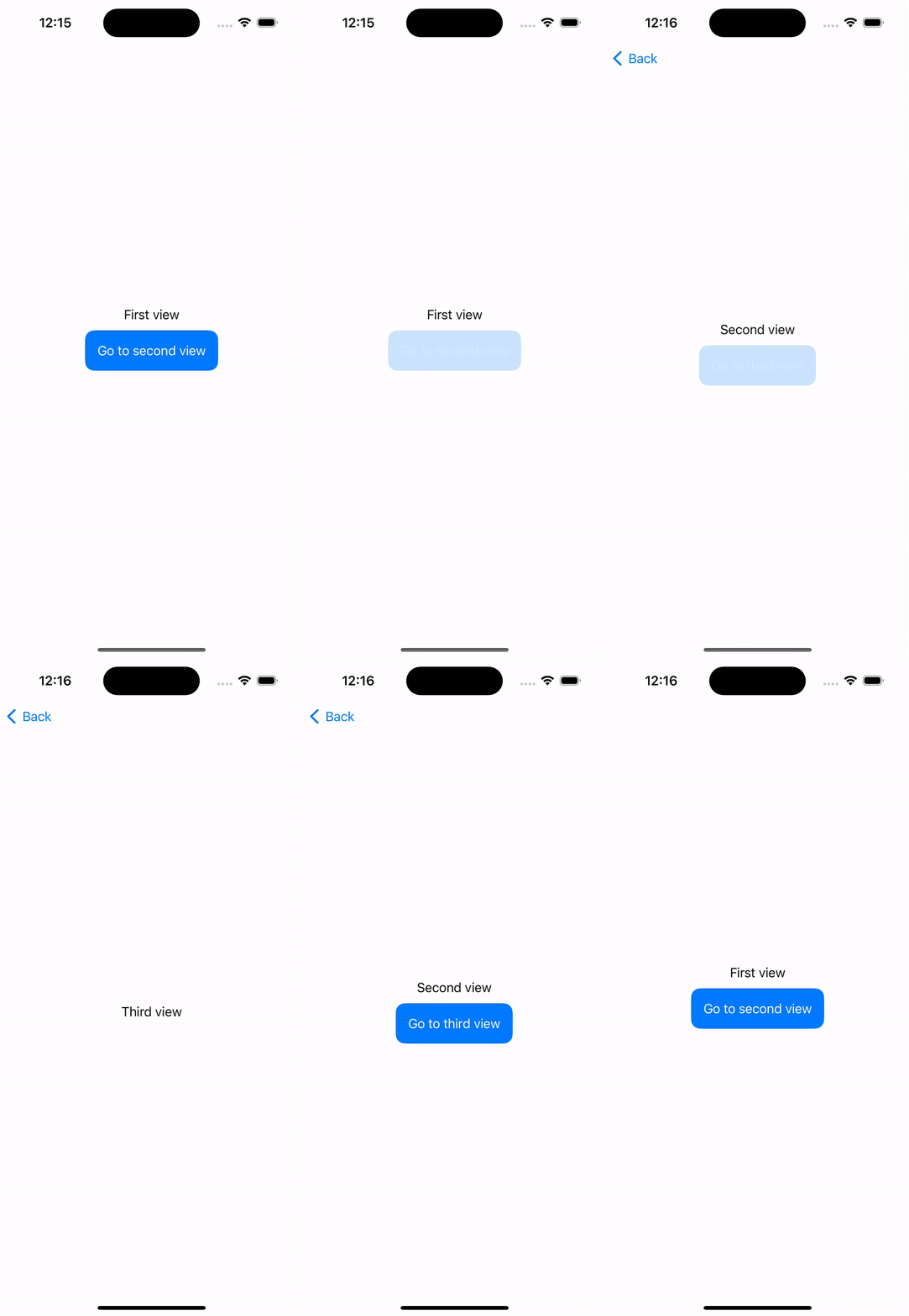
NavigationStack is the component that acts as a container on our navigation, this component provides a "navigation bar" that can contain a back button, a title and other elements.
On the side we have NavigationLink that acts like a button, where we can define the destination and the UI that the user will have to click to perform the navigation.
Let's see this in an example. First we need to create our destination view:
struct SecondView: View {

    var body: some View {
        Text("Second view")
    }
}
Then we'll add our navigation components to our ContentView.
struct ContentView: View {

    var body: some View {
        NavigationStack {
            Text("First view")

            NavigationLink {
                SecondView()
            } label: {
                Text("Go to second view")
                    .foregroundStyle(.white)
                    .padding()
                    .background(.blue)
                    .cornerRadius(12)
            }
        }
    }
}
In case we want to navigate from SecondView to a ThirdView, we don't need to add another NavigationStack since SecondView is already inside one. We'll just add a NavigationLink.
struct SecondView: View {

    var body: some View {
        VStack {
            Text("Second view")

            NavigationLink {
                ThirdView()
            } label: {
                Text("Go to third view")
                    .foregroundStyle(.white)
                    .padding()
                    .background(.blue)
                    .cornerRadius(12)
            }
        }
    }
}
struct ThirdView: View {

    var body: some View {
        Text("Third view")
    }
}
Navigation bar
The navigation bar is the element that contains some navigation items like the back button. There some modifiers available to configure this navigation bar.
.navigationBarTitleDisplayMode(.large)
.navigationTitle("Navigation title")
.navigationBarBackButtonHidden()
Let's apply these modifiers to our SecondView.
struct SecondView: View {

    var body: some View {
        VStack {
            Text("Second view")

            NavigationLink {
                ThirdView()
            } label: {
                Text("Go to third view")
                    .foregroundStyle(.white)
                    .padding()
                    .background(.blue)
                    .cornerRadius(12)
            }
        }
        .navigationBarTitleDisplayMode(.large)
        .navigationTitle("Second view")
        .navigationBarBackButtonHidden()
    }
}
Modal navigation: Sheet
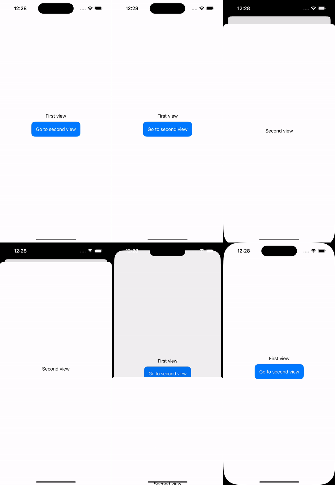
In case that we want to show our screen as a modal, we can use the modifier .sheet() and a Bool variable that will indicate when is this modal presented.
struct ContentView: View {

    @State var isSecondViewPresented: Bool = false

    var body: some View {
        VStack {
            Text("First view")

            Button {
                isSecondViewPresented = true
            } label: {
                Text("Go to second view")
                    .foregroundStyle(.white)
                    .padding()
                    .background(.blue)
                    .cornerRadius(12)
            }
            .sheet(isPresented: $isSecondViewPresented, content: {
                SecondView()
            })
        }
    }
}
struct SecondView: View {

    var body: some View {
        Text("Second view")
    }
}
In this case we just added a button that will change our isSecondViewPresented value to true, triggering our modal navigation.
$ to our isSecondViewPresented variable because .sheet() expects a binding variable since this modal view can be dismissed by the user, which will switch our isSecondViewPresented back to false.
Modal size
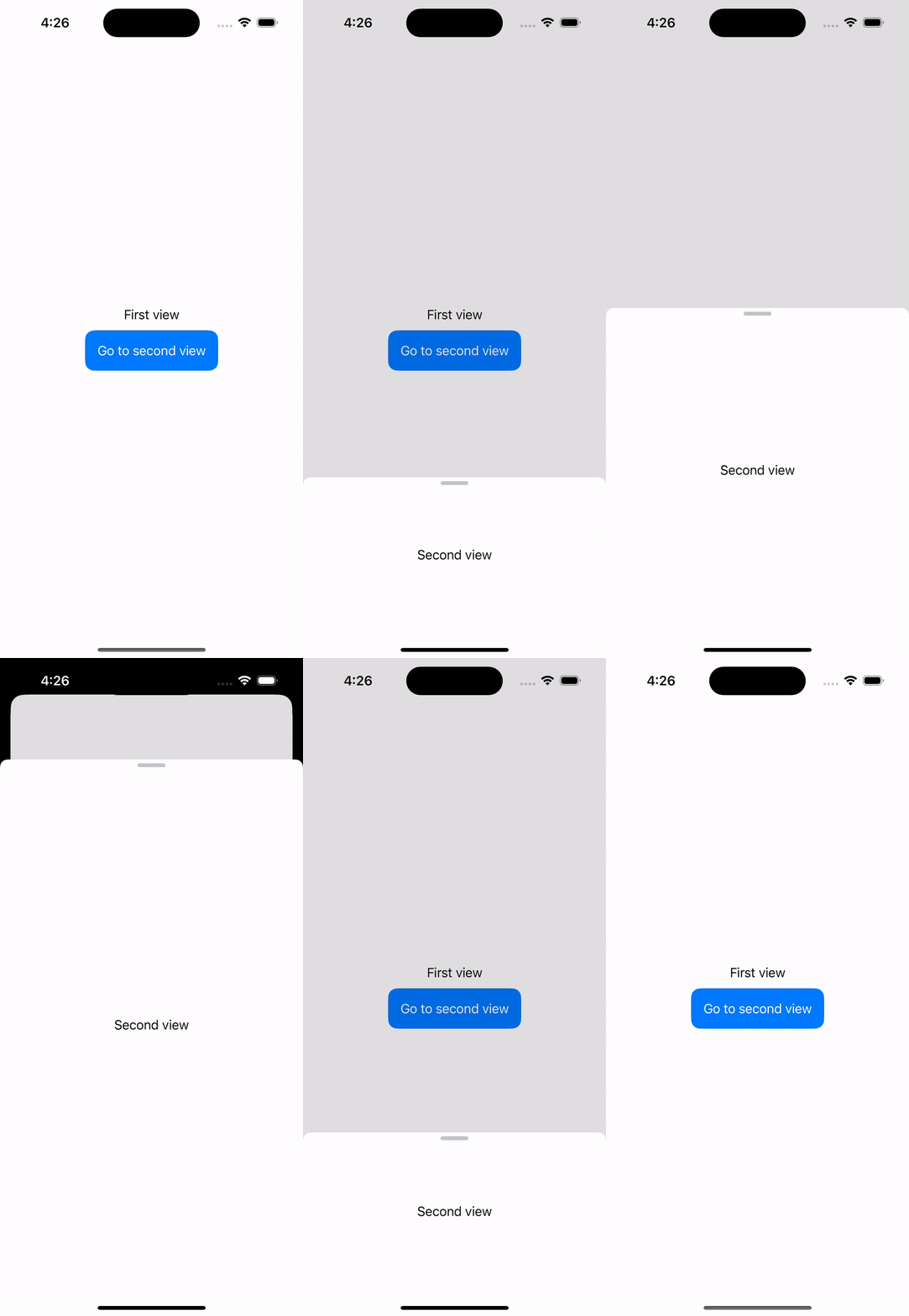
Modal is presented as full screen size by default, however this can be customised. Use presentationDetents() modifier in the presented view to define the size, the options are .large like the default one, .medium for taking only half of the screen, .height() for specifying a custom height.
This modifier takes an array as a parameter because in case you pass multiple sizes, the user will be change the size dragging the view.
.sheet(isPresented: $isSecondViewPresented, content: {
    SecondView()
        .presentationDetents([.large, .medium, .height(200)])
})


Be the first to comment